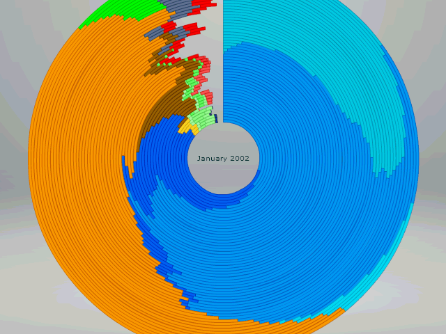
How I love cool visualizations! Especially when you can direcly interact with them in the browser. This one shows browser market shares for the last few years. It’s based on Flash and a framework called Axiis, but I’m sure somebody could make this with canvas, too.
Although this representation is not the best way to understand the data (you cannot compare by area, since the basic form is a circle and the area increases for every year), it’s a real eye-catcher. I mean, showing browser stats with a huge Firefox, how cool is that?

Oh, so that’s how Firefox came up with there logo.
http://www.mozilla.com/en-US/about/logo/download.html
ya it look like firefox logo